
Technology
Logo Design: The Secret to Success

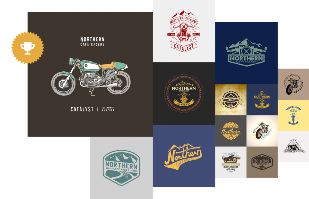
The key to having a successful business is to have an attractive, meaningful, and catchy logo. However, you MUST understand that a logo is a lot more than just a visual representation of your brand name. It can both make and break things for your business; hence it is important to have a well-designed and expressive logo. The good news is there are a plethora of logo design services available in the market to allow you to have a logo that reflects your brand.
Let us tell you that all the fuss regarding logo designing is entirely justified; after all, it is the first thing that people notice when they visit your website or see your brand anywhere on the street. If you are looking to create a first and lasting impression on your customers, creating an attractive and eloquent logo is the first step towards it. Your logo represents your brand; therefore, there is no way you can afford to go wrong with your logo design; it is not just a fancy graphic; it is the face of your brand, so take it seriously.
Nevertheless, creating a unique logo that is engaging and symbolic sounds pretty easy on paper; actually, it is a lot more than that. Hundreds of tries fail, and then you end up with the final look of the logo. In order to achieve that perfect logo, you need to have the perfect fusion of creative thinking, get a full grasp of the brands you are working on, unmatchable design skills, and execution as well. Interestingly, there are various unexplored secrets to designing a logo; here are a few of them you must keep at your fingertips.
The secret recipe to have an authentic and effective logo:
1. Understanding Brand Psychology
You cannot have a good logo until you have a complete understanding of brand psychology. To create a logo that connects with your target audience, you must keep the psychological rules in your mind. If you do not give it much importance, your brand’s chances to slip off your customer’s mind are pretty high. You do not want your competitor to create their territory in your customer’s mind, right? Start with designing the right logo that speaks your brand personality.
Start with carefully reviewing all the elements you are using in your logo, from typographies to symbols and colors. Every choice you make has an extensive impact on your prospects of evoking certain emotions and behavior. As you may already know, a rectangle in your logo shows logic and rationality, and if you use serif fonts, you are making your logo appear more sophisticated.
2. Stay in Touch with your Competitor’s Tactics
The current marketplace is pretty competitive, where there are a hundred options available to the customers for a single product or service. Even if you want to have a pizza takeaway, you are presented with at least 3 pizza stores on one street only. So why should the customer come to you? You must offer something that your competitors are not offering already to attract the customer to your store. And let your logo speak to them, connect to them on a personal level. Staying aware of the competitor’s techniques is the best way of devising your own logo strategy.
A successful and attractive logo can give you an edge over the competitors. However, to do that, you need to keep in touch with your competitor’s market standing along with their logo designs. It will allow you to come up with the logo design establishing a different market identity for yourself.
3. Respect your Brand’s Legacy
Your brand’s logo is the main element of your overall marketing communication tools; therefore, it is important to design a logo that reflects the core values of your business and presents it in a way that leaves a lasting impression and respect for your brand.
Apple is the perfect example; in this case, this tech giant’s logo still speaks for itself even after years. The logo has created an element of respect that the simple mention of the organization brings the logo in front of people’s eyes no matter where you are in the world.
4. Uniqueness is the Key
Bringing out of box ideas and being creative is the best way of keeping your audience hooked onto your logo and brand. Since there are thousands of brands out there fighting to get their target market’s attention, exclusivity is the only way to get the customers on board with you. Being different [read: good different] is important to dominate other brands in the market.
Instead of being okay with the generic logo, go a little out of your comfort zone and introduce a custom-designed logo, one that strikes a chord with the masses. It would help you create a unique identity for your business. Along with that, you will become synonymous with your business offerings as well, and best of all, you will stay ahead in the market race, where you aspire to be.
5. Stay Simple
Going overboard with the results of the design in making a logo that is complex and so out of the comprehension of a simple man, you must devise a logo that a commoner can easily understand; what is the point of having a design that requires a specific kind of comprehension capability? The simpler your logo is, the more memorable it will be.
The examples are right in front of your eyes; we all have the logos of McDonald’s, Apple, Google, Nike, and Coca-Cola etched in our minds. What is the most common element among these brands? Simplicity. The simplicity of these logos is what makes them useful. “M” of McDonald’s has become a global identity for the brand; no matter where you are, you can always spot it from far away.
6. Use the Right Colors
Logos are the game of using the right colors; they play a crucial role in making a perfect connection of your logo with your audience. Nevertheless, using the right palette and understanding the color theory is a tricky task mastered by the experts only. While choosing the colors, you must know that each color derives a certain mood or feeling. For example, red is perfect for brands looking to trigger an individual’s aggressive, passionate, and pleasant emotions.
Apart from it, you should avoid the use of colors that are hard on one’s eyes. Using the colors that are closer to each other in the color wheel is a perfect idea of using the logo’s correct colors. Whatever shade you settle for your logo, make sure it rightly aligns with your brand’s overall feel and the image you wish to portray for your audience. FedEx logo is the perfect example of utilizing two colors to the fullest i-e blue and orange. Just the use of two colors is enough to create a lasting impact on the customers.

Wrapping up!
The bottom line is, do not be cliché; the brands that rely on logo templates and do not take professional’s help are often left behind hanging. In contrast, their competitors get their market share. Do not settle for less when you can make your impact just by hiring logo designers from Ingenious Guru for your brand; after all, we all want the best for our businesses, right?
Author Bio:
Jack Leo is a professional digital marketer that is working for a leading Digital Marketing Agency – inGenious Guru. Apart from that, he is an active blogger who admires reading and sharing information regarding the latest tech trends and gaming news. He is an avid gamer who spends his nights taking on any challenger he finds in all leading FPS games.


10 Best Generative AI Tools to Scale Your Business in 2024

Katelyn Ernst: Bio, Age, Lifestyle, Career, Hair & Eye Color, Net Worth

A Brief History of Solitaire: From Cards to Computers

How To Enhance Your Learning With Duolingo Podcasts?
The Website Design Workshop: Crafting User-Centric Sites
 Technology4 weeks ago
10 Best Generative AI Tools to Scale Your Business in 2024
- Model3 weeks ago
Katelyn Ernst: Bio, Age, Lifestyle, Career, Hair & Eye Color, Net Worth
- Games2 weeks ago
A Brief History of Solitaire: From Cards to Computers
- Technology2 weeks ago
How To Enhance Your Learning With Duolingo Podcasts?
- Technology5 days ago
The Website Design Workshop: Crafting User-Centric Sites


You must be logged in to post a comment Login