
Technology
Effective Call-to-Action (CTA) Strategies for Your Website
Your website is not just a static page but an interactive tool for engaging with your audience, forging connections, and ultimately achieving your business goals. Central to this interactivity is the Call-to-Action (CTA).
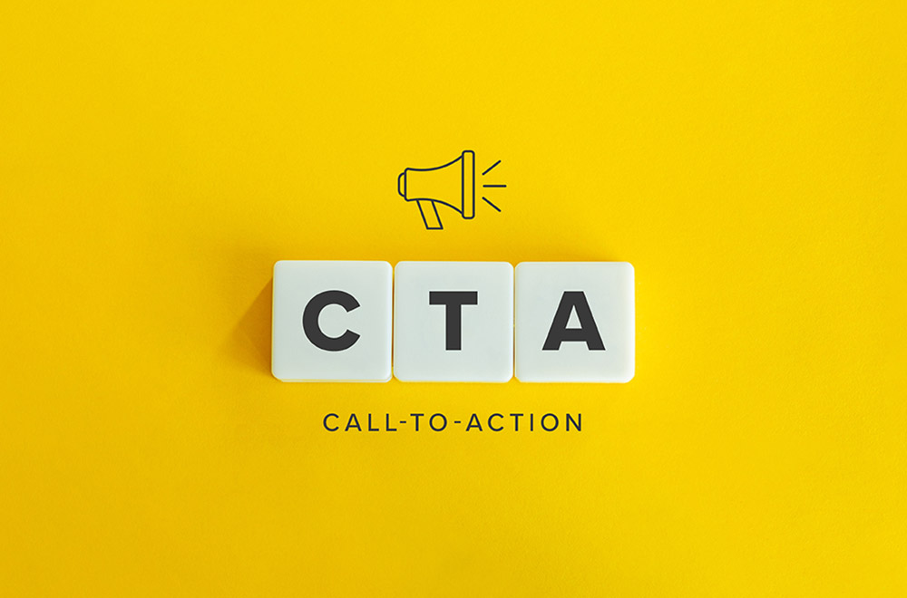
What is a CTA?
A Call-to-Action (CTA) is an element in your marketing that encourages the audience to take a specific, immediate action. It’s a focused instruction, often presented as a button or link, designed to lead the user toward a particular response.
This can range from simple actions like ‘Buy Now‘ or ‘Learn More‘ to more complex ones like ‘Sign Up for Our Newsletter‘ or ‘Start Your Free Trial.‘ CTAs are an integral part of your online strategy, guiding visitors through their journey on your website, whether to make a purchase, download content, or subscribe to your services.
CTAs are the spark that transforms passive website visitors into active participants, directing them toward the action you want them to take. They serve as the bridge between your content and your business objectives, making it vital to get them right.
Call-to-Action (CTA) Strategies for Your Website
A well-crafted CTA bridges engaging website visitors and converting them into valuable leads or customers. It’s a direct and clear directive to guide users on what steps to take next. To harness the full potential of your website, let’s delve into some effective CTA strategies that can drive user engagement and boost conversions.
Clarity and Simplicity: The first rule of a successful CTA is clarity. Visitors should instantly grasp what you’re offering and what action you want them to take. Use simple and concise language. For example, ‘Sign Up,’ ‘Buy Now,’ or ‘Get Started’ leave no room for ambiguity.
Value Proposition: Make sure your CTA communicates the value users will gain by clicking it. If it’s a download, mention what users will learn. If it’s a subscription, specify the benefits. An effective CTA provides a compelling reason to act.
Contrasting Colors: Your CTA button should stand out on the webpage. Use contrasting colors that complement your website design but grab the user’s attention. A vibrant, distinct button is more likely to be noticed and clicked.
Strategic Placement: Where you position your CTA matters. Consider the natural eye flow of your page. The upper portion is often the first point of focus. Place CTAs there. However, include them throughout the page, especially where users might need that extra push to convert.
Personalization: Personalized CTAs catering to visitors’ needs or preferences can significantly enhance engagement. For instance, a retail website could have personalized CTAs based on user behavior, like ‘Show Women’s Shoes’ or ‘Explore Electronics.’
Urgency: Create a sense of urgency by adding phrases like ‘Limited Time Offer’ or ‘Ending Soon.’ This motivates users to act promptly, fearing they might miss out on something valuable.
A/B Testing: Never underestimate the power of A/B testing. It helps determine which CTA variations work best with your audience. Test different colors, wording, and placements to find the winning formula.
First-Person Language: Using first-person language in your CTAs can make users feel like the action is more personal. Instead of ‘Buy Now,’ you could say ‘Buy My Product Now.’ It feels like a direct invitation.
Social Proof: Leverage social proof in your CTAs. Phrases like ‘Join 10,000 Happy Customers’ or ‘Rated 5 Stars by Users’ instill confidence in potential customers.
Mobile Optimization: In the era of mobile devices, ensure that your CTAs are mobile-friendly. They should be easily clickable on smaller screens without accidentally clicking something else.
Content-Relevant CTAs: Your CTA should align with the content. If the page discusses a particular product, the CTA should be related to that product. This contextual relevance improves the chances of conversion.
Exit-Intent Pop-Ups: Don’t let users leave without a fight. Implement exit-intent pop-ups with CTAs that provide an attractive reason to stay or return in the future.
Transparency: Be transparent about what will happen after the CTA is clicked. If it leads to a subscription, mention the frequency of emails. If it’s a download, clarify the file format.
Testimonials: Incorporate real customer testimonials near your CTA. Users are more likely to engage When they see that others have benefited.
Continuous Optimization
In conclusion, CTAs are more than just buttons; they are your digital sales force. Effective website design and SEO integration play a pivotal role in making these strategies successful. Your strategies should engage, inform, and guide your audience to action. By focusing on clarity, value, design, and personalization, you can create CTAs that capture attention and drive meaningful conversions. Remember, the world of CTAs is ever-evolving, so be ready to adapt and experiment to discover what resonates best with your unique audience.
So, if you are running a Jaipur website, you may consider seeking professional assistance for WordPress app development to enhance your website’s functionality and user experience further.


Tiffany Stratton: Biography, Wiki, Age, WWE Career, Net Worth, Before Fame, Boyfriend

Top 5 Tips for Using File Uploads in Your WooCommerce Store Efficiently

Why Airlines Are Using Virtual Reality Services for Pilot Training
The Hidden Costs of a DUI & How a Lawyer Can Help You Avoid Them

Exploring TikTok AI: My Experience Making a Video With Only Artificial Intelligence

How 3D Modeling Transforms AR Experiences for Online Furniture Stores?
Best Plugins for Improving WooCommerce Performance
5 Hidden TikTok Content Strategies Every Creator Should Know Now

How Orthodontic Treatment Can Prevent Long-Term Dental Problems?
 Technology2 months ago
Why Adding Videos to WooCommerce Product Galleries is Essential in 2025
- General2 months ago
What Is Smart Construction? A Beginner’s Guide
- Technology1 month ago
How to Send WooCommerce SMS Notifications for Orders
- Technology1 month ago
7 Essential TikTok Metrics to Track for Higher TikTok Views in 2025
 Model3 weeks ago
Tiffany Stratton: Biography, Wiki, Age, WWE Career, Net Worth, Before Fame, Boyfriend
- Technology4 weeks ago
Top 5 Tips for Using File Uploads in Your WooCommerce Store Efficiently
 Technology3 weeks ago
Why Airlines Are Using Virtual Reality Services for Pilot Training
- General4 weeks ago
The Hidden Costs of a DUI & How a Lawyer Can Help You Avoid Them


You must be logged in to post a comment Login