Human beings use various ways to communicate other than language. We speak through our gestures, facial expressions, and the way we dress up, and so much more. Colors are also one loud and quick method used for communication. They speak with clarity and vividness. This way of communication is used in different scenarios nowadays as it does not take much time to deliver messages. Marketing and branding utilizes this technique of communication to have the benefits. There are a variety of marketing and branding platforms that rely on colors for expressing their attributes. For instance, website layouts, packaging, branding flyers, cards, customized stuff for marketing, and so on.
Logo designs are also one of the biggest factors that depend on colors for communicating a certain idea. Since logos are one of the most important elements for any business, use of the right colors is a logo design can significantly impact the business in numerous ways. The experts of logo design pay a lot of attention to the selection of colors and in fact, there is an entire psychology of colors that is employed behind the use of certain colors for a certain logo. This article is to discuss the color trends in logo designing in order to let our readers know about the trending colors and their specific attributes in order to help the audience understand the brand’s message conveniently.
Color trends in logo designing and in general change frequently as the competition in the markets sustain high, especially if we talk about internet marketing. Several logo design experts recommend extending the canvas for marketing and come up with new ways of exhibiting emotions and brand image through peculiar and suitable color combinations and hues. 2019 is going to be packed with new color trends in the logo industry. Let us peek into the colors that will be trending and how they can be a good choice for your brand.
Fiery Reds
Almost all most successful brands in the global market have red in their logo design in some ratio. Red is a color that is extraordinarily powerful and it has this exceptional ability to stimulate immediate responsive action from the audience. Red has a huge range of shades and most of them are outstanding for marketing purposes and logo designing. The color is said to be a reminder of blood, heavy rose blooms, love, fire, strength, alertness, danger, fear, and of course, love. These interpretations of the color makes it an attention grabber and at the very same time, a bit of a risk. It can be a stimulator of annoyance and fear if not used appropriately. Brands sometimes choose to use the color with a combination of lighter colors in order to balance out the sensations. However, if you too are planning to use red, make sure it goes with your brand and the product you sell.
Earthy Tones
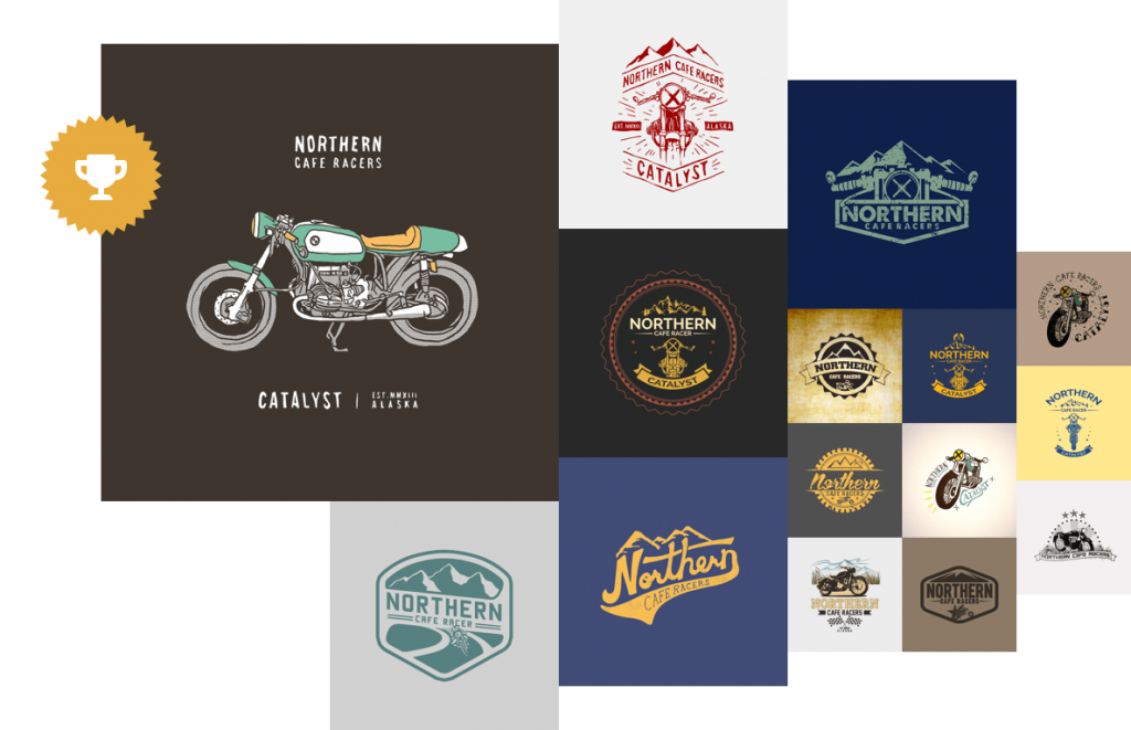
Earthy tones are soothing for the eyes as they link us with the mother earth in some way. They are powerful and yet, they do not appear too vibrant and irritating to the eyes. Since the earthy tones remind us of the mother earth, they are a strong stimulant of nostalgic feelings. This makes these shades a good color choice for the logos of products with some romantic and nostalgic attributes. Diaries, natural self-care products, and other product made with natural ingredients can use earthy tones. Earthy tones can be created with the use of colors like brown, coral, yellow, pale green, and even cold shades of blue with greenish and dusty shades. 2019 is going to be the year of these tones in logo design and in general designing because the vibrant colors has been reigning since too long and a break from them may attract the attention.
Minimalistic Color
One of the trends that is rising on in the coming year is the minimal color trend. In this trend, the artists use minimal amount of a vibrant color with a plain or subtle combinations. This makes the design scream and capture the attention instantly. These designs use colors that stand out such us bright yellow, florescent tortoise blues, and highlighted shades of green. This type of design idea is very effective for highlighting certain meaning and giving a logo a visual enrichment. Sparkling colors with some white and black combinations are going to be the hit of the coming season.
White Neutrals
Some brands can choose to stand out from all these bristling color tones by choosing the clarity and cleanliness of whites. White is the color of purity, simplicity, honesty, neutrality, and peace. This color can be a very good option for the brands willing to give their brand image some depth and calmness at the same time. The elegance of the color can enhance the brand name and make you appear more decent and amazing on the market shelves. Whites with an inclination towards grey and silver serves as an element of serenity and sleekness in the designs. Go for it if your brand needs this type of an image to attract your potential audience.

Contrasting Shades
Color contrasts in a logo can be a very risky factor for a designer. A wrong contrast can cause people to bleed their eyes out while looking at the logo. That is why most artists avoid contrasts in designing. However, a contrast that is done right can be the most prominent logo design and it can make people get attentive towards the design instantly. The good contrasting combination looks super vibrant and strikes the audience with force and stimulate response.
There are a few contrasts that are must success and has been used traditionally in the design industry. However, the current design industry is experimenting with a lot new and contrasts are one of the experimental hypes these days. These experimental contrasts are made with different tricks other than solid vibrant color hues. They are made by using shadows and different patterns too.
Author Bio:
Oscar Shepherd is a Creative Graphics & Logo Designer by his profession at London Logo Designs. He also use to write his opinions on multiple topics in order to guide people through his experience and also to spread his opinion so that people can share their thoughts and are also open for a discussion.
Color Trends for Logo Design in The Year 2019
Article Rating
Communication is done in a lot of ways rather than only speaking. With catchy logo color trends you can attract customers to your business.













Leave a Reply